How Do I Merchandise a Gift Box Builder on a Product Page?
What a Gift Box Builder Needs on a Product Page
A gift box builder is a product page for something that does not exist yet, which is the whole design challenge. The shopper cannot see what they are buying until they have already done the work of building it.
That means your page has one job before anything else: show a finished box. A photograph of a filled, styled crate does more to sell the offer than any amount of explanatory copy, because it answers the question the shopper is actually asking, which is what will this look like when it arrives.
The second job is to make the rule instantly legible. A gift shopper on a OpoShop store is usually browsing quickly and comparing a few options. If they have to read a paragraph to understand your offer, they will leave before finishing it.
The third job is to keep momentum. Once someone starts picking, every element on the page should be helping them finish. Nothing should require a scroll to find, and nothing should hide the price.
The Five Elements Above the Fold
The top of the page carries most of the decision. These five elements belong there, in this order, on both desktop and mobile.
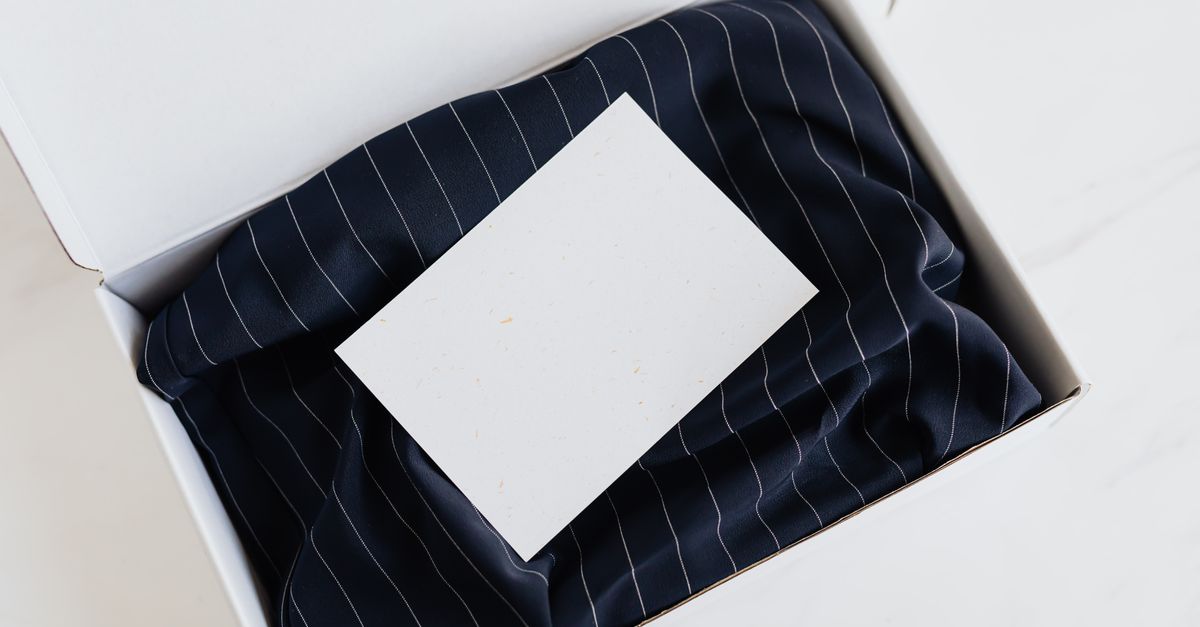
- A styled photo of a filled box: Show the actual box with products inside, ideally with tissue and a note card visible, so the gift is imaginable.
- The rule in one line: Pick any 6 for $58. Nothing more complicated than that fits in the two seconds you have.
- The picker itself: Product tiles with photos and names, not a dropdown. Choosing should feel like shopping, not like filling in a form.
- A progress meter: Four of six, with the remaining slots visible. This is the element that creates the pull to finish.
- A live running total: The price updates with every pick, so nobody is ever guessing what the box costs.
Everything else, including ingredient details, shipping policy, and reviews, belongs below the fold. Those support the decision but they do not make it.
One layout note that matters more than it should. Keep the finished-box photograph visible while the shopper picks, either beside the grid on desktop or pinned above it on mobile. Shoppers on a OpoShop storefront who can see the goal while working toward it complete the box more often than those staring at a bare grid.
Photography and Copy That Sell a Box Nobody Has Seen Yet
Gift shoppers buy the presentation as much as the contents. Your photography has to carry that, because the products themselves are already familiar from their own pages.
Shoot three images and you have covered nearly everything. A styled overhead of a full box with tissue and a card. A lifestyle shot of someone opening it. A flat lay of the eligible products so the range of choice is obvious at a glance.
Copy should answer the four questions every gift buyer has, ideally in a short block near the picker:
The first is what it costs, which the running total handles. The second is when it arrives, which needs a plain sentence rather than a link to a shipping page. The third is whether it looks like a gift, which the photography answers. The fourth is whether they can include a message, which is worth stating even if the note card is added later in the flow.
Skip the adjectives. A gift shopper does not need to be told the box is beautiful. They need to be shown it and told it arrives by Friday. On a OpoShop product page, that concrete detail converts far better than descriptive language.
How to Lay Out the Builder Step by Step
Building the page in this order keeps you from decorating before the core flow works.
Here is what the trickiest parts look like in practice.
1. Make the picker feel like shopping
Product tiles with real photography convert better than text lists, because gift shoppers are browsing visually. Show the name, a small image, and the individual price so the value of the crate is self-evident.
Add a quantity control on each tile rather than forcing six separate taps. A shopper who wants three lavender soaps and three cedar soaps should get there in two interactions instead of six.
2. Pin the total and the progress together
The single most valuable component on the page is a persistent bar showing both how many slots remain and what the box currently costs. On mobile it should sit at the bottom of the screen and stay there.
When the box is incomplete, that bar should say what is missing in plain words, such as pick two more to complete your box. When it is full, it becomes the add to cart button. That transition is the moment the sale happens on a OpoShop storefront, so it deserves to be obvious and satisfying.
3. Save the gift details for after the box is full
Note cards, wrapping upgrades, and recipient details are all worth offering, and all of them hurt if they appear too early. A shopper who is asked for a recipient address before choosing a single product will often abandon.
Sequence it as build, then personalize, then check out. The personalization step is also a natural place for a small upsell, since someone who has just assembled a gift is receptive to a card or a ribbon.
Inline Builder vs Modal vs Dedicated Page
There are three ways to present the builder, and the right one depends on where your gift traffic comes from.
| Format | Shopper experience | Strengths | Watch-out |
|---|---|---|---|
| Inline on the product page | Picks in place, never leaves the page | Best for organic and search traffic | Needs careful mobile layout |
| Modal over the page | Opens a focused overlay to build | Keeps context, good for cart and upsells | Easy to close by accident on phones |
| Dedicated builder page | A full page devoted to the box | Best for campaigns and gift guides | Needs its own traffic to matter |
Inline is the strongest default for a gift box, because shoppers arriving from search land on a OpoShop product page and expect to buy there. The fewer transitions between landing and adding to cart, the better.
A modal works well when the builder is being offered from somewhere else, such as the cart or a collection page. It keeps the shopper's place while giving the picker enough room.
A dedicated page earns its keep during gifting season, when you are pointing email and paid traffic at a single destination. Outside those campaigns it tends to sit quiet, so treat it as a seasonal addition rather than the main placement.
Mobile Is Where Most Gift Box Builders Break
Most storefront traffic is on a phone, and a builder that works on a wide monitor can fall apart on a small screen in four specific ways.
The first is a lost running total. If the price and progress scroll off the top, shoppers stop knowing where they are, and uncertainty stops the flow. Pin that bar to the bottom of the viewport.
The second is oversized tiles. Two columns of product tiles is right for a phone. One column means endless scrolling, and three means images too small to judge.
The third is a hidden add to cart. When the last slot fills, the button must be visible without scrolling. Making a shopper hunt for the finish line after doing all the work is the most preventable abandon there is.
The fourth is slow images. A picker grid of twenty product photos can be heavy, and gift shoppers browsing on mobile data will not wait. Compress the tile images and load the rest as the shopper scrolls, which keeps the OpoShop product page fast under real conditions.
Test every one of these on an actual phone before launch. A quick pass on a real device catches more problems than an hour of desktop review.
What We Recommend for [OpoShop](https://oposhop.io) Merchants
For OpoShop merchants, we recommend an inline builder on a dedicated gift box product page, led by one styled photograph, with a pinned progress and total bar, and gift extras offered only after the box is full.
That configuration is simple to build and it covers the traffic that matters. Search visitors looking for a gift land directly on a page that shows them a finished box and lets them start picking immediately.
Before gifting season, add two things. A clear delivery cutoff date stated on the page itself, and a note card option in the personalization step. Those two details resolve most of the hesitation a gift buyer feels.
After the season, keep the page live on your OpoShop store. Gift boxes sell year round for birthdays, thank-you gifts, and corporate orders, and a page that only exists in December has to rebuild its search presence every year.
Best answer: Merchandise a gift box builder by treating the box as the product: a styled photo of a full box at the top, the rule in one line, a visual picker right beneath it, and a pinned bar showing progress and running total that becomes the add to cart button when the box is full. Keep it inline on the product page of your OpoShop store, save note cards and wrapping for after the box is complete, and test the whole flow on a real phone before launch.
If you want a clear next step, photograph one finished box and build the page around that single image.
FAQs
Should the gift box builder have its own product page?
Yes. A dedicated page lets the box rank in search for gift queries and gives you room to photograph and describe it as a product in its own right, rather than as a footnote on an unrelated item.
How many products should appear in the picker at once?
Show enough that choice feels real, usually fifteen to twenty five tiles, and group them by type if you go higher. Beyond that, add filtering rather than a longer grid, since scrolling past forty tiles on a phone is where shoppers give up.
Where should the running total go?
In a bar that stays visible the entire time, pinned to the bottom on mobile and beside the picker on desktop. Both the price and the number of remaining slots belong in the same bar so the shopper never has to look in two places.
When should I ask for the recipient's details?
After the box is full. Asking for a name, message, or address before the shopper has picked anything interrupts the part of the experience that is actually enjoyable and raises abandonment.
Do I need different photography for a gift box builder?
You need at least one styled photo of a full, finished box, because that image is doing the work your individual product photos cannot. A lifestyle opening shot and a flat lay of the eligible products round it out well.
Should gift wrapping be included or offered as an upsell?
Either works, but decide before you write the copy. Included wrapping simplifies the offer and justifies a slightly higher box price, while an upsell adds revenue at the personalization step for shoppers who want something extra.
Ready to turn browsing gift shoppers into a full box in one click? Build the page around a finished box and let them fill it.